
How to choose a resume template (and why it's the last 5%)
Which resume template to pick (classic serif, modern sans, or compact) and the parsing rules that matter more than any of them. An honest comparison guide.
Search for resume advice and you’ll drown in template galleries: hundreds of designs, ranked and re-ranked, each implying that the right one is what gets you hired. Here is the honest version: the template is the last 5% of the decision. Whether your resume answers the posting in its own vocabulary (the content) is the other 95%. But that 5% has one sharp edge. The wrong template can zero out everything else by failing to parse, because a resume that software can’t read scores nothing no matter how good the words are.
So this guide does two things: gives you the short list of rules that make any resume template safe, and compares the three template families that cover essentially every real situation, so you can settle this choice in five minutes and spend your time on the part that determines outcomes.
What makes a template ATS-safe
Before a person reads your resume, software usually parses it into structured fields (name, roles, dates, skills), and recruiters search and rank those fields. A template is ATS-safe when that extraction works cleanly. Five properties decide it:
- Single column. Parsers read top to bottom. Two-column layouts get read in the wrong order or lose a column entirely: your dates detach from your employers, your skills attach to nothing.
- Real, selectable text. If you can’t select and copy the text in the exported PDF, neither can a parser. Anything rendered as an image, including text inside a graphic, is invisible to the software.
- Standard section headings. “Experience”, “Education”, “Skills”. Parsers map content into fields by these labels; “Where I’ve made an impact” maps to nowhere.
- No tables, text boxes, graphics, or photos. Tables scramble reading order, text boxes often don’t extract at all, and skill bars or icons carry information no parser receives. A photo adds parsing risk, and in many markets it gets a resume set aside for compliance reasons.
- Standard fonts. Common fonts embed and extract predictably. Decorative type can degrade text extraction and renders differently on every system that opens the file.
Notice what’s not on the list: accent colors, margin taste, whether headings carry a rule underneath. Those are aesthetics, and aesthetics are safe to choose freely once the mechanics hold. The mechanics are also the first thing to check in any tool that generates a resume for you: a builder whose export violates these rules undoes your work at the last step. We’ve written separately about what to look for in an ATS resume builder; output that obeys this list is the non-negotiable part.
The three template families
Strip away the marketing names and nearly every safe resume template falls into one of three families. The choice between them is about industry and density, not magic.
Classic serif
A serif typeface, generous margins, traditional structure. This is the template for conservative industries (law, finance, government, academia) and for senior roles where the message is steadiness rather than novelty. It also prints best: serif type was designed for paper, and interviews where someone slides your resume across a table still happen.
Choose it when the reader is likely to print, the industry is formal, or seniority is the point you’re making.
Modern sans
A clean sans-serif with a tighter visual rhythm, built for screens. Most resumes today are read in a browser tab or an ATS preview pane, and sans-serif type reads better there. This is the sensible default for tech, startups, and anything design-adjacent, where a heavy serif can read as dated.
Choose it when the resume will be read on a screen (which, most of the time, it will) and the industry skews contemporary.
Compact
The same rules with less air: tighter vertical spacing, denser type, more content per page. This is for people with a lot of ground to cover: fifteen years of experience, career changers who need to show more roles to make the pivot legible, or anyone facing a hard one-page constraint.
Choose it when cutting content would cost you relevant evidence, and the alternative is hand-shrinking the margins of a roomier template.
Sarto ships exactly these three as its PDF export templates (Classic serif, Modern sans, and Compact), all single-column, real text, standard headings, so they’re parseable by construction. The template is picked at export time and can differ per application, which is where that decision belongs: modern sans for the startup posting on Tuesday, classic serif for the bank on Thursday, same underlying content each time.
Why a new template won’t fix the silence
Here is the trap in template obsession. Your applications get no response, so you conclude the resume must look wrong and switch templates. Nothing changes, because nothing changed. Silence is almost never a formatting-taste problem. It’s a matching problem: the posting screens for “stakeholder management”, your resume says “worked with marketing and support teams”, and to a keyword search that experience doesn’t exist.
A template can only lose this game, by failing to parse. It cannot win it. What wins it is coverage, how much of the posting’s vocabulary your resume actually contains, and that’s measurable before you send anything. An ATS resume score makes the point bluntly: the same resume scores 41 in a broken designer template and 41 in a flawless one. The points come from rephrasing your real experience into the posting’s language, not from the font.
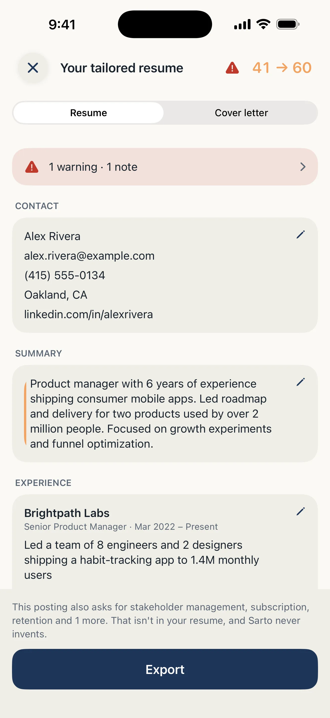
The template is the last 5%; this is the other 95%: the same facts rephrased into the posting’s language, every change a reviewable diff.
If you’ve been cycling through templates for weeks, redirect that energy: score your resume against one real posting, look at the missing keywords, and close the gaps you can honestly close. That single pass will do more than any redesign.
A short decision checklist
Five questions, in descending order of weight:
- Does it parse? Single column, selectable text, standard headings, no tables or graphics or photos, standard fonts. If no, stop. Nothing else about the template matters.
- Where will it be read? Screen-first industry: modern sans. Print-likely or formal: classic serif.
- Does everything relevant fit? If you’re deleting genuine evidence to make the page, switch to a compact layout instead of squeezing a roomy one.
- Is it boring in the right way? A template’s job is to disappear so the content gets read. If the template is the most memorable thing about your resume, the content isn’t finished.
- Can you switch it per application without rework? Template choice should be an export-time toggle, not a rewrite. If changing templates means re-entering your history, the tool is working against you.
The honest summary
Pick a family, confirm the parsing rules, and stop deliberating. In Sarto the template question is deliberately one tap at export (Classic serif, Modern sans, or Compact), because the app spends its effort where applications are actually won: importing your real resume, scoring it against the posting, and closing vocabulary gaps with rephrasing the server verifies against your original, so nothing is ever invented. That order of priorities is the whole argument of this guide. Get the words right first; any of the three templates will carry them.